To add a shadow to a box using CSS 3 using the box-shadow property February 9, 2010
Posted by minals in CSS Hacks Tips and Tricks, Expression Web Tips and Tricks.Tags: box-shadow, box-shadow property, CSS 3, element shadow, shadow, special effects
add a comment
One of the best features of CSS 3 is box-shadow that allows you to add shadow to any element. The property is at present implemented only in Safari 3 onwards and Firefox 3.5 onwards.
An example of the output generated by this property is shown below:
Isn’t it spectacular? And this is possible with a single property; ‘box-shadow’.
The property takes 3 integers and a color attribute.
1. Horizontal offset of the shadow; a positive value will place the shadow on the right of the box, a negative value will place the shadow on the left of the box.
2. Vertical offset; a positive value will put the shadow below the box and a negative value will put the box-shadow on top of the box.
3. Blur radius; beginning from 0 (sharp shadow), the higher the number, more blurred it will be.
4. Value for color.
box-shadow: 10px 10px 10px #888; padding: 5px 5px 5px 10px
NOTE: To add a shadow to the box with rounded corners, use the border-radius property in addition to the box-shadow property.
To get the same effect as shown in the image above, use this code.
<div style="-webkit-box-shadow: 10px 10px 10px #888; padding: 5px 5px 5px 10px; background-color: black; width:130px;">
<img src="../ maroon_leaves.jpg" alt=”Leaves; ”/>
</div>
NOTE: The box-shadow property is prefixed with -webkit- in Safari and -moz- in Firefox. That is because, most browsers support custom CSS tags that are not yet part of any standard. So they are prefixed with the browser name.
But the box-shadow property is still not supported in Internet Explorer and other browsers. To get a similar effect (without using images as shadow) is not possible (or it is something that I am not aware of!) In my next article, I will show you a way to create shadow effect for box without using images.
Visual Effects with Page Transition in Microsoft Expression Web 2 February 7, 2009
Posted by minals in Expression Web Tips and Tricks.Tags: event, Expression, Expression Suite, Expression Web, Expression Web 2, HTML, Microsoft, page, page open, page transition, special effects, transition, tricks, visual effect, website
add a comment
A page transition is a visual effect with which a page opens or closes. For example, fading, wiping out. You can add a page transition to multiple pages in a website.
Adding a page transition
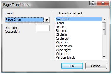
Go to Format menu > Page Transition to launch the Page Transition dialog box (shown below).

Choose following options in the Page Transitions dialog box:
Event: Select the event for which the page transition should occur. You have four events to choose from;
1. Page Enter – when a page opens in a browser.
2. Page Exit – when a page loses its focus.
3. Site Enter – when a web site is opened for the first time.
4. Site Exit – when the web site loses its focus.
Duration (seconds): Enter the duration in seconds, for which the page transition effect should last.
Transition effect: Choose the type of transition effect you want to apply.
NOTE: You can add transitions to more than one event, but be careful as to not create too many flashy effects as it may lead nuisance to the viewer and may not visit your web site again.

